


Edge is a groundbreaking system of professional development tools and workshops for employees to help them better communicate, collaborate, plan, and problem-solve.
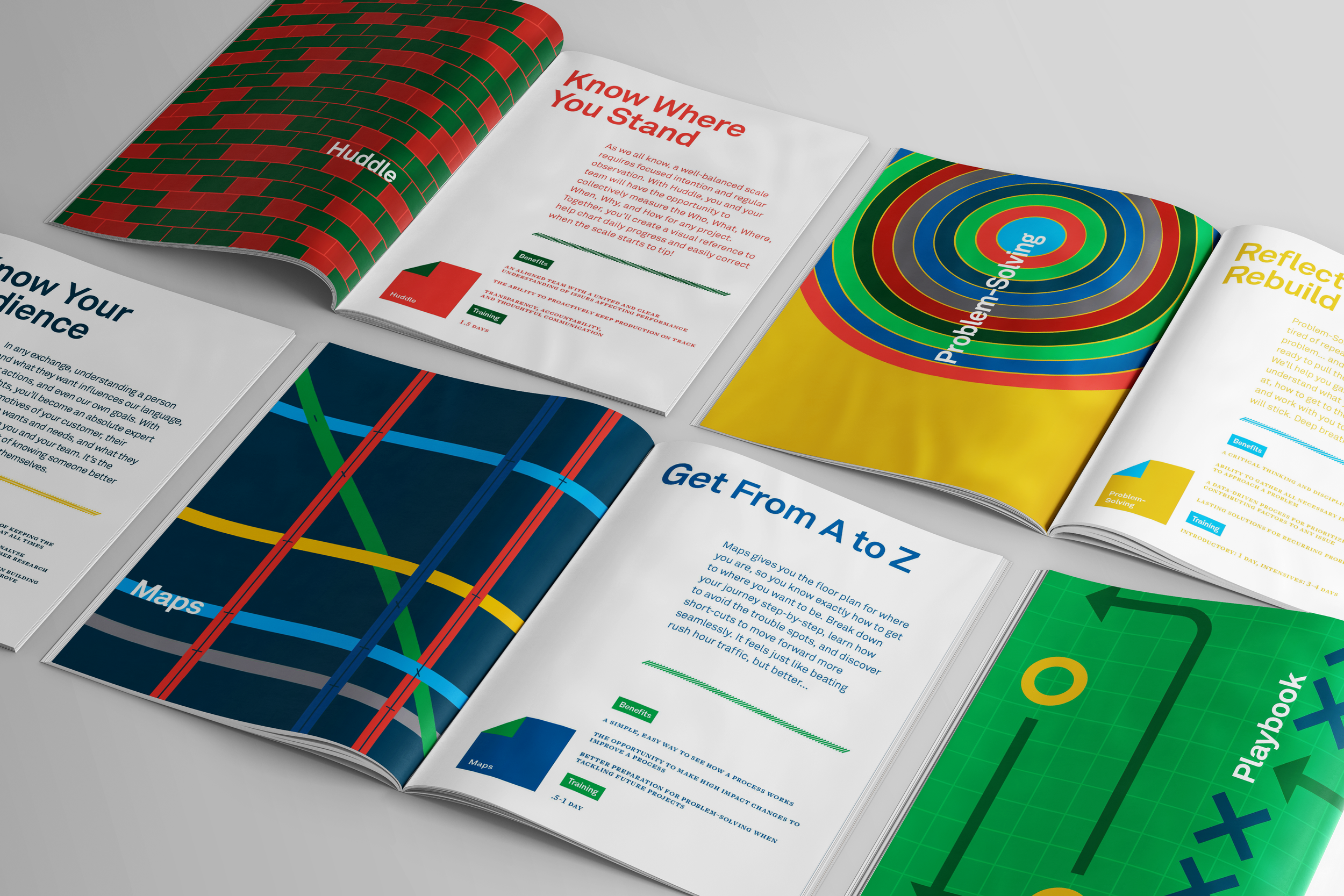
Our team was tasked with making the Edge team “the cool kids”. We launched a full rebrand that took on a human-centered and relatable approach, energizing staff to transform how they work from the inside out.
Color Palette
We devised a color palette that feels equal parts bright/energetic and professional/adult. Each tool has its own individual color palette, creating 8 sub-brands underneath the parent brand.
Language and Tone
The renaming of each Edge tool was key to the rebrand. With a Gen Z audience, our strategy was to make the language and overall tone active, casual, and direct.
Visual Daily Management became Huddle.
Value Stream Mapping = Maps
Kaizen = Implement
Standard Work = Playbook
Voice of the Customer = Insights
…and so on.